Saturday, July 27, 2013

Modern Masterpiece??

You know, there are very few things in this world that whet the Disney fanboi's appetite the way great piece of concept art does. Personally, I love concept art. In fact, I would argue (along with many others) that looking at concept art often times leads to disappointment in an attraction or environment after it's been experienced in real life. Concept art allows fans to "fill in the blanks," if you will. We get to use our imaginations to decide what that new dark ride is going to be like, or what kinds of "Disney-details" can be found in that new land. The reason we're able to do this? For the last 60 years, Disney has been displaying concept art that is nothing short of masterpieces. Full of detail and energy, as we study the images they almost feel as though they come to life. And just as it takes multiple trips to a theme park in order to truly gain an appreciation for the details of its surroundings, it takes multiple views of the art in order to really absorb all that is being shown. 

With all of that said, I think it's time for another epic addition of the game, "What Doesn't Belong Here!?
The rules are simple. Below, you'll find a few of my favorite conceptual pieces that I've saved over the years. All you have to do is guess what piece feels out of place. Ready??
Here we go...

Tony Baxter's Discovery Bay

An unused rendering of EPCOT Center's entrance by Herb Ryman

Hong Kong's Adventureland overview from the mind of John Horny

Eddie Sotto's Sci-Fi City Tomorrowland envisioned for Tokyo


The Disney-MGM Studios' Hollywood Blvd by Collin Campbell

World of Color "Winter Dreams"


What's that? You say the poorly-named "Winter Dreams" rendering is the one that doesn't fit in? Give yourself a great big pat on the back, You got it right! Great work gang!

In all seriousness though, just look at how bad that piece of "art" is. It's painful, really. In fact, from the moment I saw this photoshopped horror yesterday, I immediately felt embarrassed for Disney. How on earth did anyone even begin to think that this garbage is acceptable? I really don't understand how a company that was literally built on art could possibly allow this to slide. GAH! It's not as though Disney has a huge shortage of artists that couldn't show the world something more professional...heck, Disney, next time you need a piece of concept art, please ask me to do it! I promise I'll work for free!

In the meantime, I suppose the fans will just have to stick to past pieces of art in order to get our concept art fix. Either that, or we could always check out So You Want To Be An Imagineer on the Visions Fantastic forums. Honestly, when fans (mostly basketbuddy) in an armchair Imagineering competition are able to create more professional looking artwork than the number one media company in the world, you know there's something wrong.


Monday, June 17, 2013

So You Want To Be An Imagineer Project 4: The Great Movie Ride

Les Miserables Scene Layout
1) Charlie Chaplin Production
2) Singin' In The Rain
3) Mary Poppins
4) Fantine--"I Dreamed A Dream"
5) Valjean
6) Javert
7) Thenardier's Inn

Scene 5: A New Hope

Sunday, May 26, 2013

So You Want To Be An Imagineer Season 11--Six Flags

A rough draft of a potential coaster concept done in MS Paint.

Various coaster concepts

"Mono-Coaster" as it is currently calls. The single bar allows the coaster to switch from being a regular coaster to an "inverted" coaster. It can also spin.

A glass "pod", allowing vehicles to load onto the Ferris Wheel. 

A profile view of a potential roller coaster design with the "Ferris Coaster" concept.

More to come...


Sunday, May 19, 2013

So You Want To Be An Imagineer Season 11--The Legend of Zelda

"Nintendo World Headquarters" overrun by the World of Hyrule


A few notes...

-The queue reflects the Lost Woods as best as I could interpret/understand it.
-The Nintendo World Headquarters sign is the Controller at the front of the queue.
-The attraction sign is the Zelda game cartridge at the front left of the queue. 
-In the back left corner, you'll find the logs that Link can walk through from one of the Zelda games (I forget which one). 
-Also in the back left corner is a sword and a shield from the game (I saw a screencap of that as well).
-In the center of the queue is a fountain featuring the Tri-Force...I imagine it would look similar to the upside down waterfall at Imagination.

"Nintendo Revolution" ride vehicle


Be sure to check out So You Want To Be An Imagineer on Visions Fantastic to discover this and other future projects!

So You Want To Be An Imagineer Season 11--The Legend of Zelda Preview

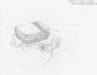
Early, Unfinished concept of "Nintendo World Headquaters"

Although this piece of Concept art is unfinished, you can see that the showbuilding itself is designed as a tribute to the classic NES. Eventually, the Grounds of the "Nintendo World Headquarters", although normally neatly manicured and featuring statuettes of famous Nintendo characters, will be made to look disheveled,with the world of Hyrule consuming  everything surrounding the building. Be sure to check back later for the rest of this and other exciting concepts of So You Want To Be An Imagineer Season 11!